Over the past two years, my eyesight has taken a nosedive. Maybe it’s just the natural side effects of being in your 30s. Or perhaps over a year of staring at screens with no break during lockdown was, in fact, bad for me. Regardless of the reason, my once pristine vision is gone and I’m now nearsighted.
That’s made me more acutely aware of the gaming industry’s love of miniscule text, HUD elements, and other user interface considerations. I’m lucky in that I can just put on a pair of glasses when something on screen is too small for me to see, but others, like partially blind players, don’t have that option. They’re at the mercy of a game’s accessibility options, which don’t always account for every problem.
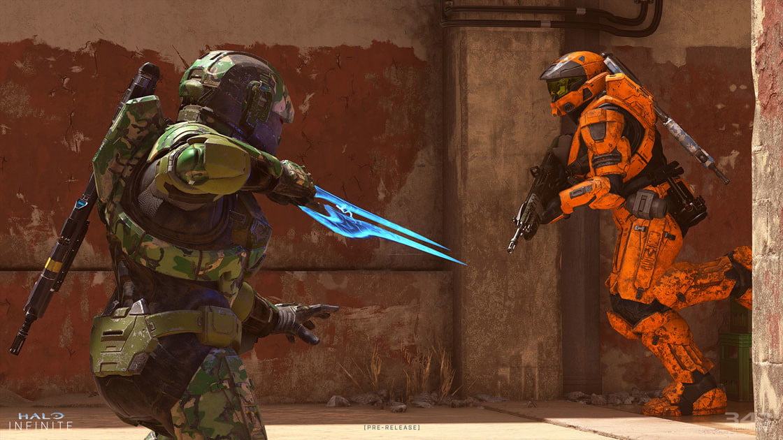
That’s my primary concern when I play Halo Infinite’s multiplayer. The beta’s current UI is nothing short of a nightmare for those who already have difficulty seeing games. While features like a lack of mode-specific playlists and a weak battle pass are drawing the most criticism at the moment, added accessibility tools should be the game’s primary concern.
A (big) tiny problem
There’s a lot happening on screen during a Halo Infinite match. You have radar, a health bar, equipment information, a score bar, a kill feed, and tips that pop up on screen when you die. That’s all pretty standard for a shooter these days, but it can create a difficult balancing act. Developers want players to be as immersed in the game itself as possible, which often means shrinking or minimizing HUD elements to allot more screen time to the action. In fact, Halo Infinite’s UI menu allows players to turn off the HUD entirely.
What it doesn’t allow me to do, as far as I can tell, is increase the size of anything outside of some text or menu font size. That solves a few problems, but I still find myself squinting at key moments, even with glasses on.
To the game’s credit, developer 343 has included an impressive suite of accessibility options outside of that. Players can turn down the opacity on screen elements, which is a big help, or disable confusing visual ticks like speed lines that appear while dashing. I applaud the work that’s gone into both audio and visual accessibility overall, though that makes the limited UI scaling all the more puzzling to me.
I’ve essentially given up on using the dime-sized radar entirely. I generally never know what gadgets I have equipped or how much ammo I have. It’s not just the persistent HUD elements that are presenting challenges for me. In the game’s Stockpile mode, a tiny white symbol marks where power cells are on the map. In my first round, I could not see the symbols. They kept getting lost in off-white rocks, forcing me to bug my friends about what I should even be looking for during an entire round.
I wasn’t the only one who had complaints during my first six hours with the game. Everyone I partied up with voiced similar confusion. Some teammates were confused about how to pick up weapons, not noticing the sliver of semitransparent text on the screen. They’d frequently be shocked when a game ended, simply not noticing what the score was despite it being pinned to the bottom of the screen. I thought the problem may be less noticeable close up to a big monitor, but a colleague playing on PC noted many of the same challenges when we played together. I shudder to think what the game will look like when it comes to the Steam Deck or phones via Microsoft’s cloud gaming service.
Puzzling decisions
Not every issue is about size. Halo Infinite makes a whole bunch of puzzling UI decisions. Equipment menus are laid out as a battle pass-like rail that has to be scrolled through. In-games subtitles butt right up against the score bar, rather than using the wide open space above or below it. Weirdest of all, the game allows players to choose their armor colo, which means that you might see an enemy in friendly blue armor instead of red. The game’s solution is to add a (too) subtle outline around characters.
There’s a saying in the accessibility community that has stuck with me over the years: “Accessible design is just good design.” Halo Infinite is facing a visual literacy issue at present that doesn’t just affect those with impaired vision. It’s simply hard to read visual information on screen unless you’re playing on a gigantic monitor. Not everyone will have that problem, and it’ll decrease as people get comfortable with the game’s language, but there’s no downside to letting players scale things up. It’s not giving anyone an advantage; it’s letting them see crucial information.
I have no doubt that more size adjustments will be available in the future. Microsoft is leading the charge on accessibility in gaming, as seen with games like Forza Horizon 5. Even Halo Infinite goes above and beyond most modern games with its suite of tools. Still, small text and UI are a persistent problem in lots of games, and one that only becomes worse as tech allows us to play games on any screen.
Let’s hope this is one of the reasons Microsoft is labeling the surprise launch a “beta.”


