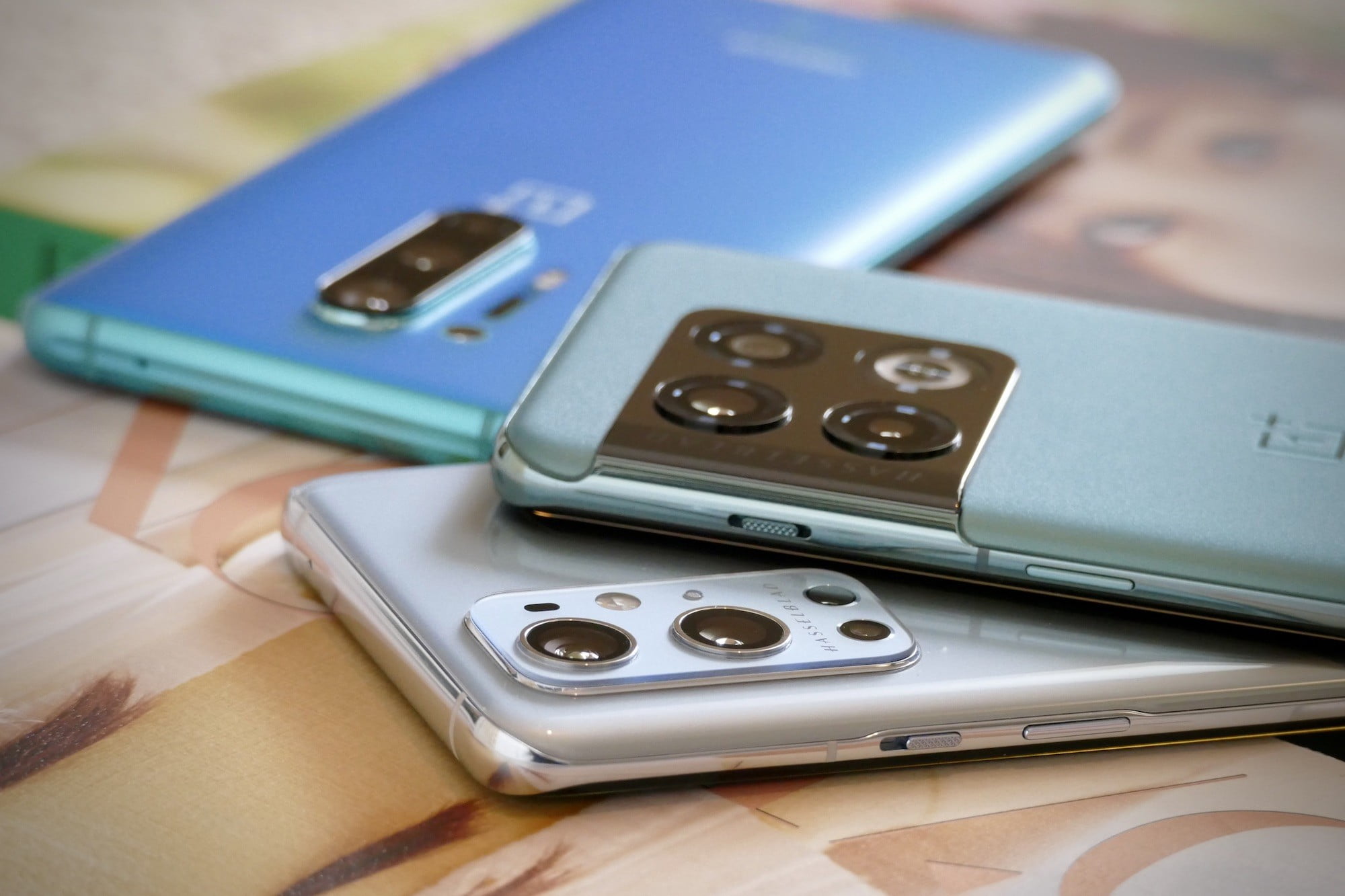
OnePlus and Hasselblad first partnered in early 2021 and since then we have seen the OnePlus 9, OnePlus 9 Pro, and OnePlus 10 Pro all arrive with Hasselblad’s name attached and its photographic expertise added to the camera’s software.
It has been difficult to really pinpoint the differences Hasselblad has made though. Armed with the OnePlus 9 Pro, the OnePlus 10 Pro, and the pre-Hasselblad OnePlus 8 Pro, we’ve taken a selection of photos to better understand how, or if, Hasselblad and OnePlus have improved its cameras.
The cameras
The OnePlus 8 Pro was the last flagship phone to be released before Hasselblad came on board. In the top-center, a stick-thin camera module hides a 48-megapixel main camera, a 48MP wide-angle camera, and an 8MP telephoto for 3x optical zoom, plus a 5MP camera for the odd Color Filter mode. The selfie camera has 16MP.
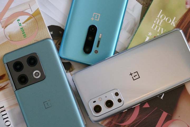
The OnePlus 9 Pro has a 48MP main camera and an 8MP telephoto camera, but the optical zoom level increases to 3.3x, while the wide-angle camera has 50MP. There’s also a 2MP monochrome camera and a 16MP selfie camera. Finally, the OnePlus 10 Pro repeats the same main specification, but ditches the monochrome camera and ups the selfie camera to 32MP.
Hasselblad lends its second-generation Hasselblad Camera for Mobile software to the OnePlus 10 Pro, while it’s the first generation version on the OnePlus 9 Pro. Each version is designed to reproduce natural color tones in photographs. The two companies have not worked together on the hardware. The images you see here have been resized for web-friendly use but were assessed on a color-calibrated monitor prior to resizing for the test.
Main camera
Shot on a very bright, sunny day with the sun behind me, this photo has a great deal of color in it, so it should be the Hasselblad-tuned cameras’ early moment to shine. The results are very different in all three.

Starting out with the OnePlus 8 Pro, in what will become a theme for the camera, it has a subdued, slightly washed-out tone. Anyone wanting visual pop will have to add it in with a filter, although in terms of accuracy, it’s not all that far off from what I saw on the day with my own eyes. There’s a good level of detail too.

Move to the OnePlus 9 Pro and the missing visual pop has been added in. The sky is bluer, the clouds more white, and the earthy tones are deeper. There’s real patina on the digger’s body and age to the glass. I like the way it has exposed the shot, as you can see some detail inside the scoop and around the grille when you zoom in.

Finally. there’s the OnePlus 10 Pro, which has taken the OnePlus 9 Pro’s photo and turned it all up to 11. Much as I’d like life to be as colorful as the photo suggests, it’s a little optimistic. The digger’s cab is too yellow, and the sky just a little too blue. It’s not realistic, unfortunately. This seems to have affected the exposure, as there’s a lot of dark shadows obscuring detail on the digger.
Winner: OnePlus 9 Pro
Wide-angle camera
The first thing to know about these photos is it was not as stormy as it looks in two of the photos, with the third coming much closer to showing the real weather conditions on the day. There’s not much to distinguish between the wide-angle photos taken by the OnePlus 8 Pro and OnePlus 9 Pro.
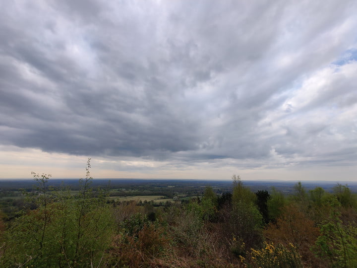
The OnePlus 8 Pro’s photo shows a brighter, less dynamic scene than the OnePlus 9 Pro, but the exposure is very similar and shrouds a lot of the foreground foliage in shadow, making it appear rather drab and windswept. Hints of the blue sky peek through in both photos, but the darkened clouds set the tone for the image.

It absolutely wasn’t a different day when I took the OnePlus 10 Pro’s photo, but the environment looks different enough that you’d be forgiven for thinking that I did. The foreground shows the sun’s (which was behind me for the photo) influence, and the exposure makes the sky far less foreboding. It’s the scene I saw with my own eyes.

Apart from the superior technical treatment of the scene, the OnePlus 10 Pro gets the colors right too, with the varying shades of green and brown captured perfectly, showing the foliage transitioning from fall to spring.
Winner: OnePlus 10 Pro
Optical zoom
Having an optical zoom feature on your phone can add versatility and make it more fun, but only when it’s properly implemented. I didn’t think it was possible for an optical zoom to look like a digital zoom, but OnePlus seems to have achieved it with the OnePlus 10 Pro. Each of these photos was shot in the early morning using the 3x or 3.3x zoom setting in the camera app.
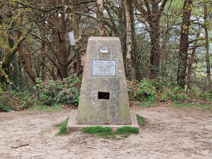
The OnePlus 8 Pro may be the oldest phone in the test, but it has taken the best photo here. It has judged the tone of the ground correctly, as well as the color of the foliage, and given the image a brightness that matched the lovely morning sunshine. More importantly, zoom in and the text on the sign is sharp and readable.
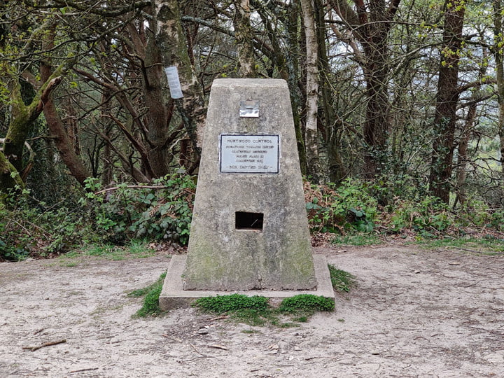
The OnePlus 9 Pro’s photo dulls the colors and lowers the exposure, and there’s far less definition in the foreground and the background. Zoom in on the writing and there’s pixelization around it, and the weathering on the stonework is muddy and lacks definition too. It has none of the life seen in the OnePlus 8 Pro’s photo.
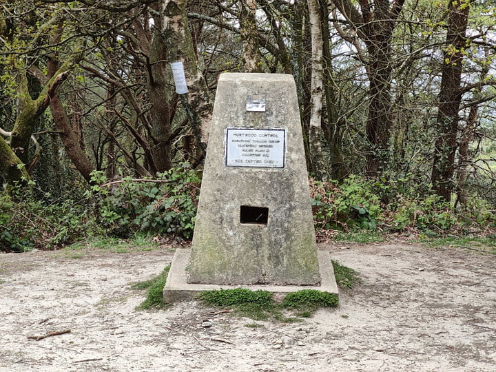
What about the OnePlus 10 Pro’s optical zoom? It’s even worse than the OnePlus 9 Pro’s photo, with poor clarity and definition, and barely any detail on the stonework. If I didn’t know it was an optical zoom shot, I’d assume it was a digital zoom photo. The colors of the foliage are closer to real life, but the OnePlus 8 Pro nailed them too and delivered great quality in the bargain. We experienced a very poor showing by the 9 Pro and 10 Pro here.
Winner: OnePlus 8 Pro
Coffee and biscuits
Taken indoors in moderate natural light, this photo highlights where Hasselblad’s involvement has changed OnePlus’ cameras, and evolved over the first generation and second generation platforms. Amazingly, you can actually see how the processing has resulted in a better end photo as you examine the 8 Pro, 9 Pro, and 10 Pro’s images.

The OnePlus 8 Pro’s photo is acceptable, but a little washed-out. The green of the chopping board isn’t very eye-catching, and the coffee is paler than it is in real life. Taken as a whole, the photo is not very visually exciting (yes, I know the subject isn’t either), and would benefit from some editing to make it somewhat shareable.

The OnePlus 9 Pro’s photo shows a subtle improvement in color accuracy, with brighter green and darker, more chocolatey coffee. There are also blacker blacks and whiter whites on the top of the Biscuiteers tin. It’s less washed out and has more life. However, it’s not perfect, as the writing on the tin isn’t as sharp as the OnePlus 8 Pro’s photo.

Finally, the OnePlus 10 Pro’s photo gets the white balance spot-on, and it makes a huge difference to the image. The top of the coffee container is better color balanced too, and the green of the cutting board has some pop to it. The coffee in the glass has a chocolatey look (as it should) and the image as a whole is far more appealing.
Winner: OnePlus 10 Pro
Night mode
You may expect the OnePlus 10 Pro to run away with the Night mode test. After all, how well lowlight photos come out has a lot to do with the software and AI processing behind them, and enough time has passed since the OnePlus 8 Pro came out for it to have noticeably improved. It’s not that simple here, though.
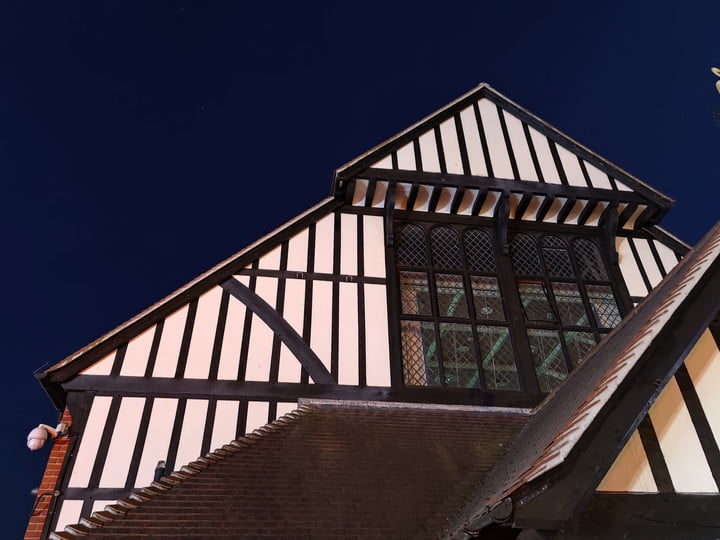
I took various lowlight images and have struggled to choose the example to show here because they have either performed almost identically, or one photo has come out so badly I have to assume it was an error on my part or a software glitch. None escaped this either, with each phone taking a poor image on at least one occasion.
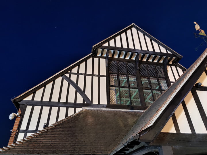
I’ve chosen a nighttime rooftop shot because it shows the general differences I saw in all the photos I took. The OnePlus 8 Pro is very sharp, very bright, and has an excellent color balance. The OnePlus 9 Pro often failed to match it in sharpness, but was better at handling white balance.

The OnePlus 10 Pro mixed the two, with great white balance and tone, but sharpness and detail suffers when you look closely. The OnePlus 9 Pro didn’t take any of the best lowlight images, but the OnePlus 8 Pro and OnePlus 10 Pro usually came close to matching each other when judged as a whole. There’s no clear winner here, as none have performed in a standout manner.
Winner: Draw
Portrait mode
Using Portrait mode with the rear camera, I tapped to focus on the midpoint of the extended log here. All three have done a good job of isolating the subject, and of gradually blurring it out as it shifts to the background. The OnePlus 10 Pro has a stronger blur effect and is perhaps slightly heavier-handed when transitioning between focus and blur.

I like the OnePlus 8 Pro’s shot, which has a pleasing tone, effective blur, and plenty of detail. What’s interesting is how much warmer the tone is than the OnePlus 9 Pro’s photo, which has cooled the scene considerably. The greens in the background are less pronounced, and even the log itself has a bluer tint to it.

The photo was taken mid-morning, long after the sun had come up and long before it had set. However, the OnePlus 10 Pro’s photo has such a strong sunlit effect, you’d think it was golden hour. It goes far beyond the warmness of the OnePlus 8 Pro’s photo, and becomes less natural because of it. It was not what I saw in real life. I’ve said this a few times when looking at all these photos, and it’s because Hasselblad and OnePlus emphasize “natural colors” as being a benefit of their camera software.

That said, I like the eye-catching treatment of the scene in the OnePlus 10 Pro’s photo, but would probably tweak the OnePlus 8 Pro’s photo to get a little more pop and retain the natural look. Depending on whether you want that visual pop or a more natural look will likely determine which photo you like best.
Winner: OnePlus 8 Pro
Portrait Selfies
Taken indoors with the light in front of me, these three selfies are very different from each other. Once again, there is evidence of Hasselblad’s tuning improving color accuracy over the 8 Pro, and evolving with the 10 Pro. However, the photos still aren’t perfect.

The OnePlus 8 Pro makes me look very flushed (I wasn’t) and I wonder if this has been taken from the tint in my glasses, as it’s considerably pinker here than in the other images. Color aside, the definition of the image is good and the portrait effect is surprisingly effective, even around the edge of my glasses. With some editing it’s shareable.

The OnePlus 9 Pro’s portrait effect is very similar to the OnePlus 8 Pro’s, but there’s a huge difference in colors. My skin no longer looks like I’ve just been told something rather embarrassing, but the rest of the colors are all oddly rendered. The walls are not that color and my shirt has far more defined white and blue colors.

Colors in the OnePlus 10 Pro’s photo are exactly right. My skin looks right, the walls are correct, and so is my shirt. It’s pretty much how things looked in real life. The portrait effect is probably the best of the three as well, with defined edges and smooth transitions. However, it’s not a very sharp photo. It may have twice the megapixels, but it’s less defined than the OnePlus 9 Pro’s photo.
Winner: OnePlus 10 Pro
Conclusion
There are seven categories in our test and all phones met in a draw in one, while the OnePlus 10 Pro has won three of them, making it our overall winner. Perhaps the bigger surprise is the OnePlus 8 Pro — a phone released in April 2020 and without Hasselblad tuning — won two, leaving a single win for the OnePlus 9 Pro. None of the phones have stood out as being the obvious “best” choice, with significant drawbacks to each one. The optical zoom remains a big disappointment on the OnePlus 10 Pro, for example.

But what about Hasselblad? In some of the photos, it’s very clear where the tuning and color calibration from the company has been improved and is beginning to pay off. Without putting the OnePlus 10 Pro’s photos alongside the OnePlus 9 Pro’s, it’s quite hard to pinpoint where the alterations are and whether it’s making any difference. In this test, it’s also clear that the second-generation software is a big step forward over the first generation.
But it’s when you put the OnePlus 8 Pro into the mix that things become awkward for the OnePlus 10 Pro. OnePlus and Hasselblad could learn from the OnePlus 8 Pro’s performance in the categories it won, and also in the scene where both lost out to the OnePlus 9 Pro. A lighter touch and some more subtlety, surprising missteps given the supposed pursuit of a natural style, would have seen the OnePlus 10 Pro win more categories.

After a marked defeat against the iPhone 13 Pro, the OnePlus 10 Pro has redeemed itself somewhat against the phones it has replaced. There’s still some work to be done, but in many situations, Hasselblad’s colors really do shine through more in photos taken by the new phone.
